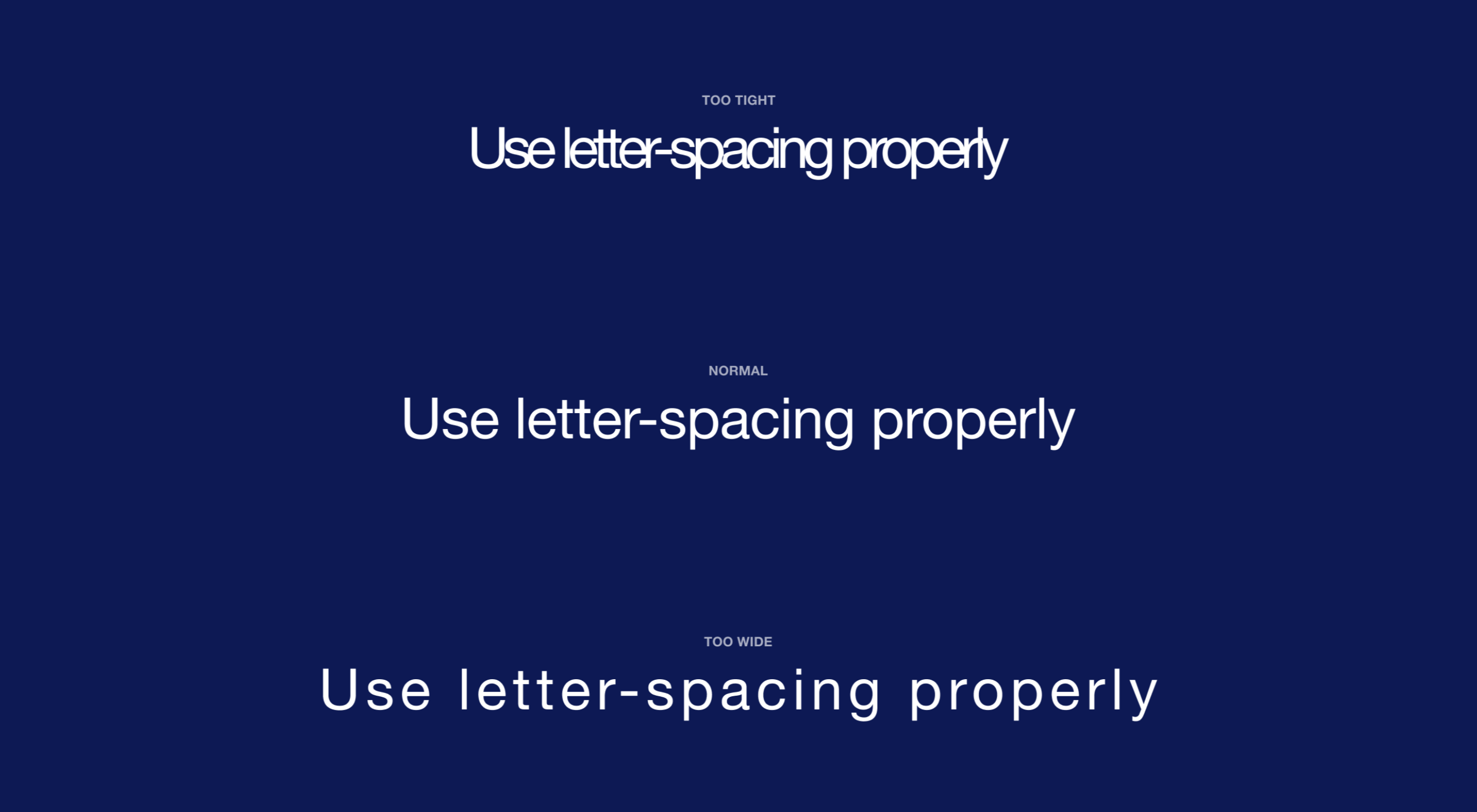
Most of the information we consume happens through reading, so it makes a lot of sense to pay attention to the words when designing. There are many aspects to typography, but one of the things that helped improve the quality of my design was letter-spacing.
Letter-spacing is about adding and removing space between letters. Some people confuse it with kerning, but these two are different; letter-spacing affects the whole line of text, whereas kerning adjusts the space between two individual letters at the time. Kerning is best left to type designers, besides which, unlike letter-spacing there is currently no way to control kerning in CSS.
I believe that practice and a lot of observation will change the way you treat letter-spacing in your work as well.
The Purpose of Letter-Spacing
The main purpose of letter-spacing is to improve the legibility and readability of the text.
